Speck Dempsey
Logo for an urban planning duo making the world a more walkable place.
Duration
Fall 2023
Activities
Logo Design
Role
Graphic Design Intern, Team Bierut, Pentagram
Team
Michael Bierut, Britt Cobb, Tamara Mckenna, Ethan Pidgeon

Background
Founded in January 2024 by Jeff Speck and Chris Dempsey, Speck Dempsey is an international design firm based in Boston. It serves municipalities, non-profits, and private developers globally, making towns and cities more walkable.

Jeff Speck is an acclaimed city planner who advocates for walkable cities through roles like Director of Design at the National Endowment for the Arts and his consultancy. He authored influential books such as "Suburban Nation" and "Walkable City," with the latter being the best-selling title in its field in the past decade. Speck has received significant recognition, including the Seaside Prize, marking his substantial impact on urban design.

Chris Dempsey has significantly influenced public, private, and nonprofit transportation policy and advocacy. As Massachusetts' Assistant Secretary of Transportation, he co-founded the MBTA's pioneering open-data program. Dempsey is a respected transportation advocate named "Bostonian of the Year" in 2015.


Jeff Speck has given two TED talks, including The Walkable City, and 4 ways to make a city more walkable
“The General Theory of Walkability explains how, to be favored, a walk has to satisfy four main conditions: it must be useful, safe, comfortable, and interesting.”
Jeff Speck

1
The Challenge
To establish success and credibility from launch onward, Speck Dempsey approached my team under Michael Bierut at Pentagram to create a strong logo and foundational brand identity package for use across letterheads, business cards, social media, and other materials. We had to complete all this work rapidly approaching launch in roughly one month.
They wanted their logo to be simple but witty. It had to inherently say something about the partners and their work in a clean and sophisticated mark.
2
The Process
We began with pen and paper sketches before moving on to digital exploration. Given that we were working with urban planners of good taste, we tailored the process to be more flexible. Rather than showing them a minimal set of options, the process flowed more collaboratively, with us exchanging ideas and feedback regularly.
A peek at the many initial typographic and iconographic explorations I did. The goal was to explore a wide variety of directions to help define where the clients’ tastes lay.
Concept refinement
After much exploration, we presented a slightly paired-down selection of potential directions. Three stood out to Jeff and Chris, which we continued to refine.

The first direction was inspired by the DON’T WALK/WALK signs that mark crosswalks near and far. We created a mark for Speck Dempsey that evoked the signs and could be animated to flip from orange to white, just like the street lights.
The second direction [below] stemmed from a similar idea, this time using a customized version of the iconic pedestrian designed in harmony with the geometry of the wordmark.

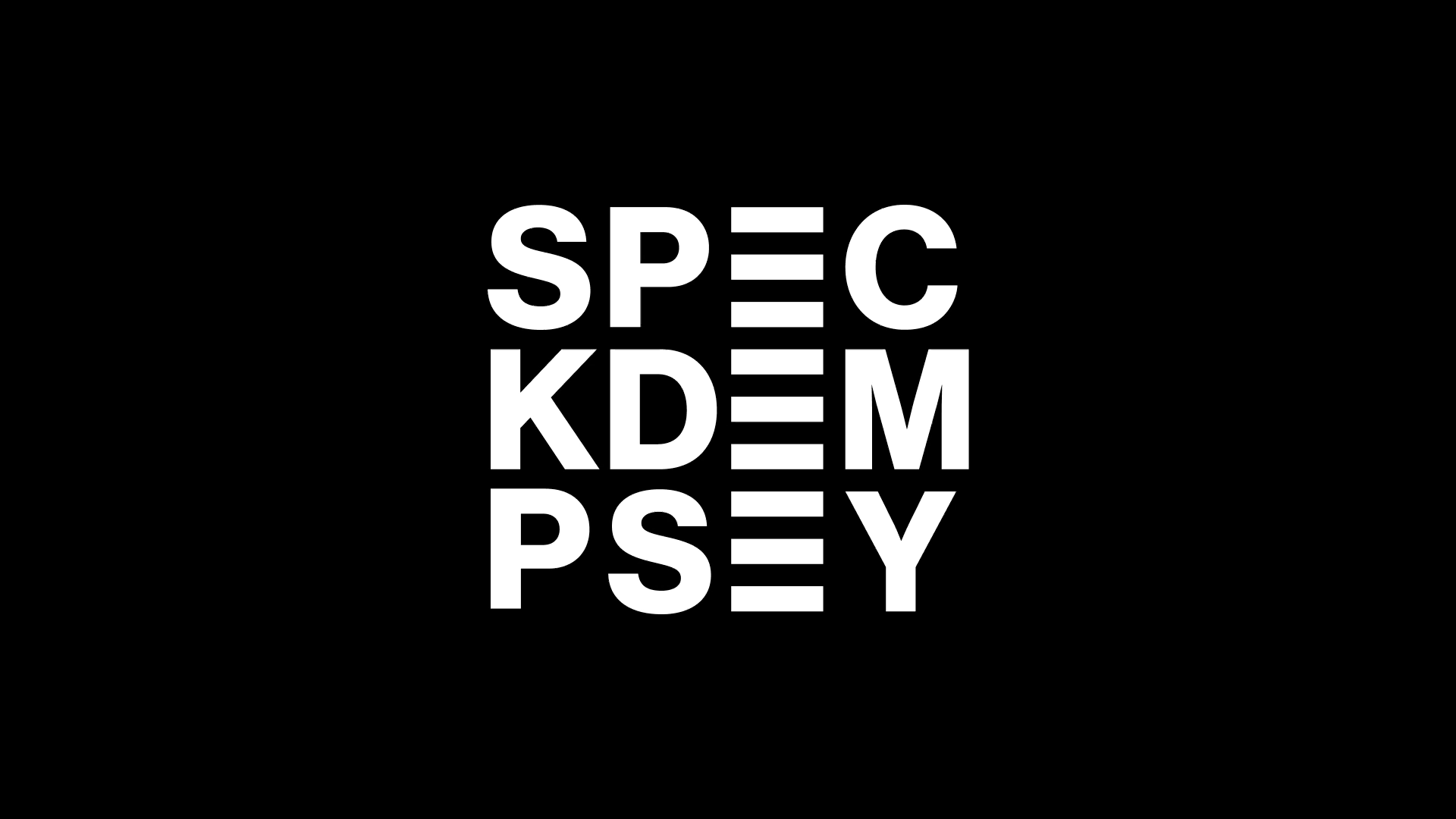
The third direction stemmed from a simple idea. What if we used the E’s to create crosswalks in the wordmark? This direction seemed to have legs, but it needed work to get the spacing and arrangement of letters right and still be legible. We worked through several iterations on this concept alone.


Several iterations on the crosswalk idea.
3
The Solution
Jeff and Chris strongly favored the crosswalk concept (as did we). It was a simple idea: Speck Dempsey puts pedestrians first and makes places more walkable. The crosswalk is the perfect icon to fit their ethos. As an added bonus, the motif aligns with the cover of WALKABLE CITY: How Downtown Can Save America, One Step at a Time, Jeff’s bestselling book. After a round of tweaks and refinements, we delivered the final logo package.
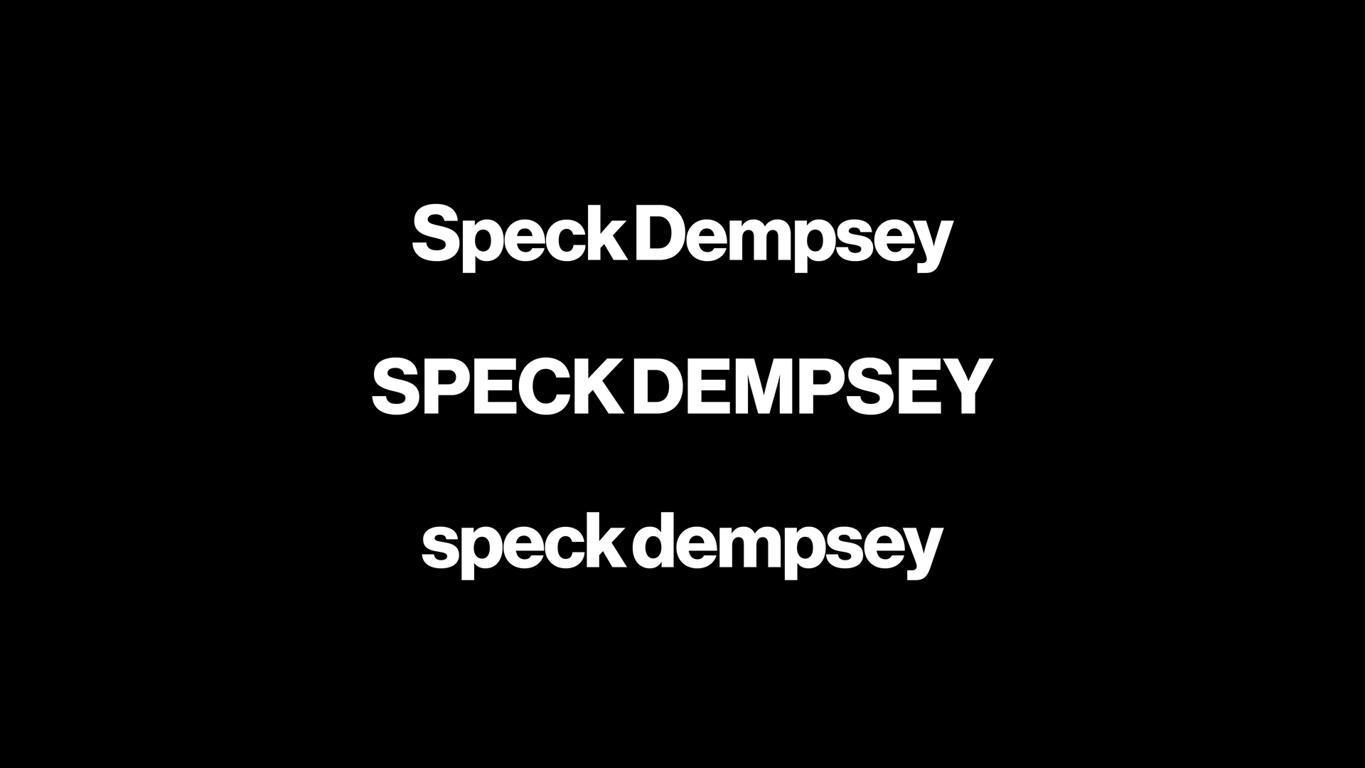
The final lockup uses a stacked wordmark set in Akzidenz Grotesk. The crosswalk connects the two names, which was constructed using the weight and proportions of the typeface to replace the two E’s. The icon, derived from the wordmark, is one-half of the crosswalk, or one E. Its proportions are perfectly square, making it legible and handy across social media and the web on a small scale.


We decided to go with Akzidenz Grotesk. The New Urbanists, of which Jeff Speck is a member, advocate for a different approach to urban planning that puts the pedestrian at the forefront. Ironically, the approach is progressive and traditional, as this approach dominated urban planning before the onset of cars. Akzidenz, one of the earliest sans serif typefaces, reflects this balance between modernity and returning to our roots. Its straightforward simplicity provides a sense of trustworthiness and clarity fit for large corporate and municipal clients.
4
Reflection
This project was exciting for me because it was one of the rare instances during my time at Pentagram when I was the primary designer on a project. Though it was a challenge given the short time frame, I was proud of the breadth of explorations and concepts I could create. I believe the end product successfully responds to the brief and will serve Speck Dempsey well for years to come. Though a comprehensive brand identity was out of this project's scope, I am eager to continue working with the partners as they grow their business.