Colibrí Mexican Bistro
Elevating the brand for a 20-year-old restaurant in the heart of San Francisco.
Duration
Spring 2022
Activities
Design Strategy, Brand Identity Design, Print Design
Team
Ethan Pidgeon
Alex Agahnia
Brendan Brady
Background
Colibrí Mexican Bistro has been serving unparalleled, delectable Mexican cuisine for 20 years. For 18 of them, the restaurant was located in Union Square, SF, but in 2021, owners Eduardo & Sylvia Rallo decided to move into the heart of the historic Presidio. In conjunction with the reopening, they wanted to elevate the brand identity to reflect the quality of their lovingly crafted dining experience.
1
The Problem
Colibrí’s existing brand identity was dated and inconsistent. While the logo had built up some brand equity, the restaurant had no cohesive brand system, often creating materials and collateral on the fly. This created a perception of Colibrí that did not align with the level of their services.
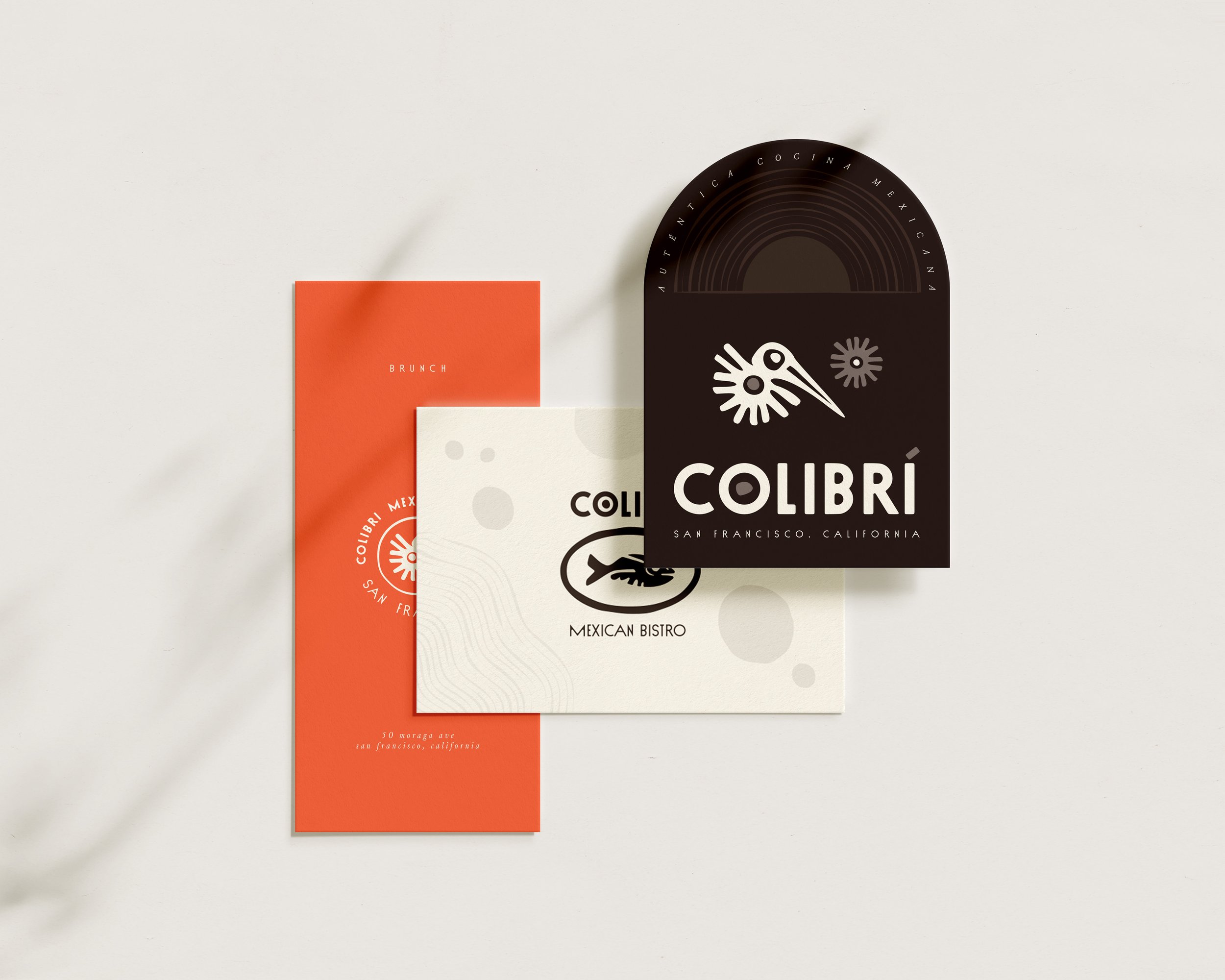
The original Colibrí logo featured a stylized logo and inconsistent typography across applications. In Spanish, Colibrí means hummingbird, hence the bird illustration.
The menus and printed collateral lacked the professionalism and refinement that Colibrí deserved. Generally, there was no rhyme or reason behind their visual brand presence.

2
The Process
The client gave us significant room to play and explore, providing little creative direction beyond the phrase contemporary hacienda, reflecting the owners’ desire to put a modern, elevated twist on the authentic Central Mexican dishes they grew up eating.
Exploring the visual vocabulary
We began by creating mood boards to help us visualize this concept. What does ‘Contemporary’ look like? What does ‘Hacienda’ look like? We pulled wide-ranging inspirational images that would serve as the foundations for our design explorations.

From here, we each began to sketch design concepts, imagining new logos, color palettes, illustration styles, and more. Each direction effectively addressed the brief with varying degrees of change from the original design. As we explored, taking a mild, medium, spicy approach helped us imagine many possibilities, many of which we were quite excited about.


3
The Solution
Ultimately, the client decided to keep the hummingbird illustration to preserve the existing brand equity. We cleaned up the mark and used that as the foundation for the final brand concept.
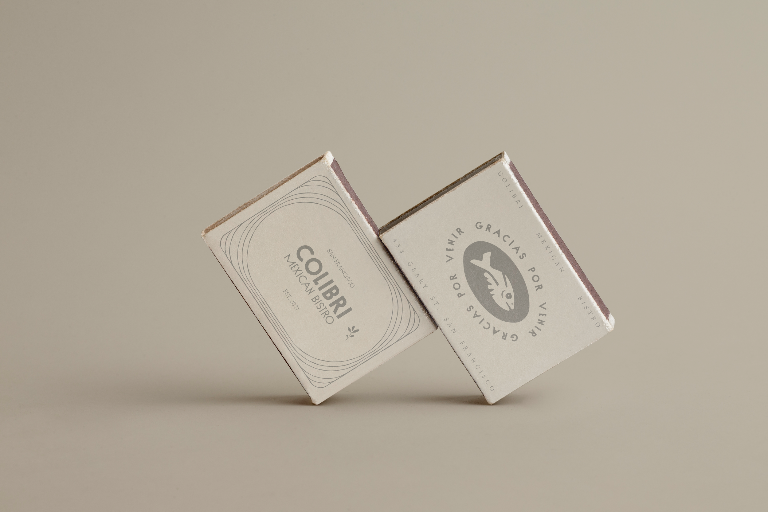
We could tie in the illustration more successfully with the type by finding a typeface with a similar weight and character to the stroke of the bird and replicating the motif of the concentric circles. We also treated the accent over the ‘í’ as if it was a bit of food that the hummingbird was after.

Michelin star typography
We selected Nord by VJ Type as the primary typeface. Its organic character has lots of personality and fits nicely with the existing logo illustration. It’s paired with Sud, also by VJ Type, which has the same bones and acts as a perfect sidekick. Louize by 205TF makes an elegant addition to the system, contrasting nicely with the more organic, all-caps primary typefaces. We set a strong foundation for the “Contemporary Hacienda” concept here.


Colors you can taste
The primary color palette is grounded in organic, neutral browns, off-white, and grey. This more monochromatic system provides ample opportunity to create an elevated look and feel. Lower contrast pairings allow us to add depth to compositions with background elements without compromising legibility. The vibrant orange accent was essential in maintaining the balance and duality of this concept.

Adding a bit of spice
We built some design elements using the logo illustration and type system as a foundation. Organic shapes can be used as background elements to add texture and depth. Using the feathers from the hummingbird, we also created a repeatable flower or sun illustration. We again matched the character of the original illustration in our new animal illustrations, beginning to develop a more versatile system with the same personality. These forms also emulate ancient Mayan and Aztec illustrations, featuring flat, abstract forms, rounded edges, and concentric circles.

3
Application
One of the most important stages of this project was implementing the brand identity. Using the new system we created, the team and I designed a system of menus, uniforms, promotional materials, packaging, and more, which worked together to elevate the Colibrí experience.


04
Reflection
Ultimately, the client was thrilled with the results, and we delivered all of the assets they needed for a successful grand re-opening within three months. Colibrí continues to serve countless happy customers every week. This was an exercise in working with constraints and making the most of what you are given. As a food lover, seeing our hard work proudly displayed at such a historic and prominent location is exciting and rewarding.
